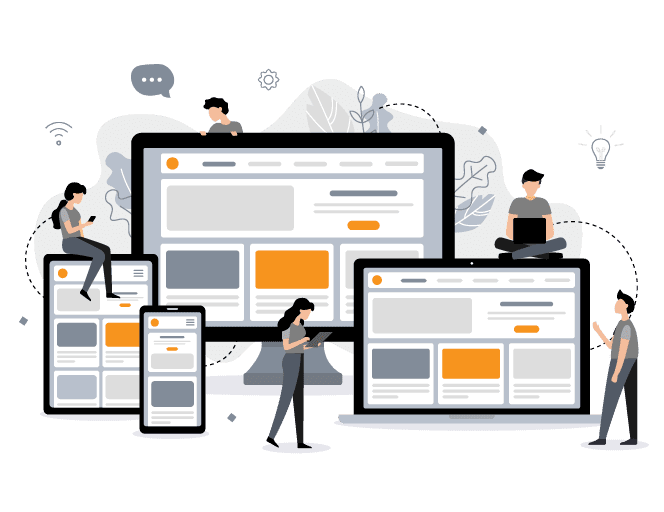
Every web designer faces many challenges. One of them is ensuring the best possible user experience, regardless of the device the user is using and responsive design is one of the possible solutions. The other one is an adaptive design. Due to the responsive design being somewhat simpler to apply and thus more budget-friendly, we use it in the majority of our projects.
If we are developing your website, it will be mobile-friendly and designed for an optimal experience across all devices ~ desktop, tablets, and smartphones.
Already Have a Website?
How Responsive Is It?
We'll review it for you and send you a Free Report!
Let’s check how your website is doing on different devices and see if your website is reaching its full potential. However, we won’t stop there. We will show you other useful information about your website that you will find very helpful.
With over 25 years of experience and many satisfied clients, we know what it takes to succeed in this complex digital age. Creating a website, these days, is very easy with the use of the many available tools, but the key is to know what works and what doesn’t. We know how to identify problem areas and find the best possible solution, and everything we do will have its purpose, so you don’t waste time and money on things that don’t work.